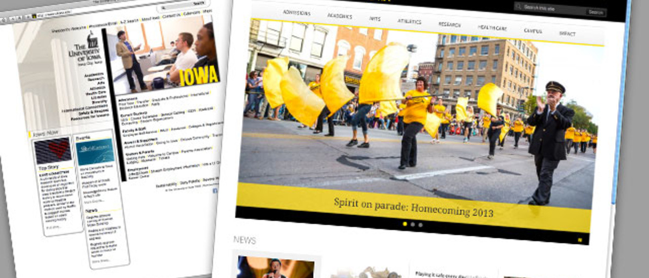
New in 2014—a completely overhauled gateway to the University of Iowa on the web. Expect to see a more modern, functional, and flexible home page with the start of the spring semester, a new site that introduces the UI, but also offers handy resources for students, faculty, staff, and other regular users.

Lin Larson, director of creative services for University Communication and Marketing—which has teamed up with Information Technology Services on the project—offers a preview of the new site.
What prompted the redesign project?
The current UI home page site—which encompasses the home page and many pages linked from it—launched in 2008. A lot has changed since then, from back-end technology, to design practices, to user expectations.
We started laying the groundwork for a new home page nearly two years ago, establishing where we’d like to improve and getting feedback from people across campus.
How will the new site improve on the current one?
We took the opportunity to rethink the site from the ground up—the redesign isn’t just a facelift, but a fresh start.
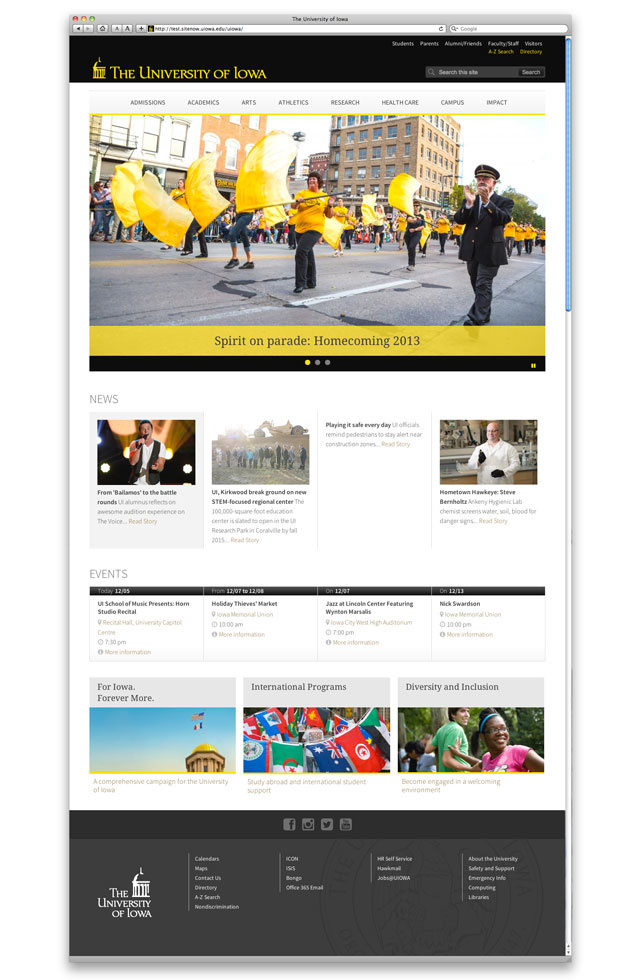
Scroll down to see a preview of the new site design and learn about the new home page's main features.
We want to balance the needs of people who are just discovering the university and people who use the website regularly. The new site will foreground information that gives new users a sense of who we are. At the same time, it’ll offer ready links to resources for students, staff, faculty, and others.
The new site will make menus simpler to scan and navigate. It will provide lots of ways to showcase links to different UI websites, news stories, and event information.
We’re also enhancing second-level pages geared to different topics and audiences. These pages will highlight information much the way the new home page does, providing a consistently richer experience for users.
The new site will scale to fit mobile devices like phones and tablets. This year, about 8 percent of site visits have come from mobile devices, and that figure will only grow.
Finally, the site adopts a content management system—Drupal, which is powering lots of new UI websites—that will make it much easier to update and maintain.
Tell us more about the balancing act you’re trying to achieve.
I mentioned balancing new and repeat users. We chose to make info for new users especially prominent and central, recognizing that the home page remains a valuable front door to the UI online. At the same time, we’re providing repeat users with easy-to-find links for the tools they use the most.
We’re also looking to strike a balance between navigation and storytelling. We’re designing a site that’s functional and doesn’t stray too far from conventions users expect from university websites. But we’re also making room to show what makes our university unique.
What would you tell someone whose favorite link has moved, or even dropped off a particular page?
We wanted to simplify the menu structure to make the site more usable and mobile-friendly. The redesigned home page indeed has fewer links, in part because the menu organization is different—and, we hope, better. Also, some links have moved to second-level pages, where they’re showcased for the audiences who use them most.
To make decisions about link placement, we looked at traffic patterns for the current home page site. We emphasized the links that get the most use and sought better homes for those that don’t get a lot of clicks.
I’d ask folks concerned about any changes to help us identify potential improvements once the site launches. We want to keep a close eye on traffic patterns and collect feedback as people start using the site. We expect it to be a work in progress.
What sort of input have you sought to date?
When University Communication and Marketing (UCM) started this project, we established an advisory group of campus web and communication professionals. They offered essential feedback on early concepts and were instrumental in helping us set project goals.
When it came time to design and build the site, UCM teamed up with ITS web services. Together, we reviewed the research we’d done to date, paying particular attention to structure and navigation.
Once we developed a design, we sought feedback from dozens of campus colleagues, including representatives from the colleges. Those conversations informed a working prototype, which we presented to larger groups of web developers, communication pros, and administrators.
We recently presented the site to university leaders, including collegiate deans, President Mason, and her cabinet. The whole process has yielded a lot of good ideas and generally positive feedback. We’d like to keep the discussion going even after launch.
What do we know about how people use the home page?
To date this year, the home page site has been visited more than 11 million times by nearly 2.4 million people. Some 2.5 million visits came from University of Iowa computers, and more than 7 million visits from the Iowa City area, but we’ve had visitors from over 200 countries this year.
Search tools, including A-Z listings, are the most commonly used resources on the site, but our most visited pages include a mix of pages dedicated to topics, tools, and audiences.
As you might expect, traffic to the site spikes at the start of each semester. Week by week, traffic almost always peaks on Mondays and slowly drops off toward the weekend. This pattern turns out to be very consistent and predictable.
So, a lot of different people use the home page in a lot of different ways, which takes us back to the issue of balance. It also underscores the need to keep doing research and making improvements.
Maybe more than any communications resource, the home page feels like it belongs to our whole university community. As stewards of the site, it’s our responsibility to keep the community involved as we evaluate information that helps us best meet users’ needs and best represent our university.


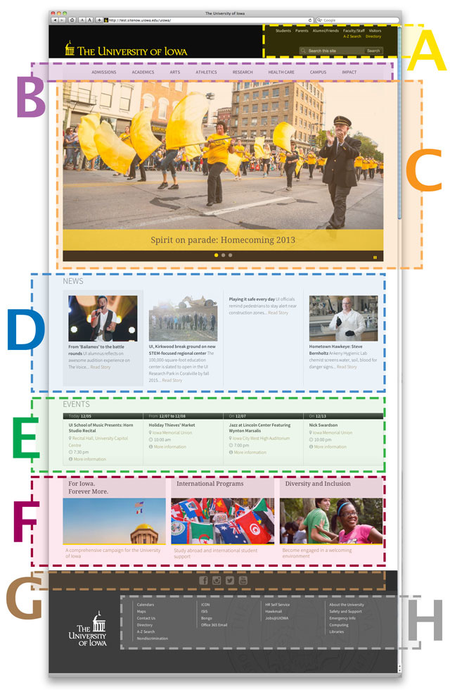
An annotated guide to the features of the new home page: Working version of the design at right, notes below.
A—Audience menu: Links to pages designed for groups who frequently use the site
Search tools: Links to A-Z website listings and phone/email directory, plus a global UI web search
B—Topic menu: Links to pages about major UI missions and endeavors
C—Main rotator: Revolving, regularly updated images that show university life, but also link to sites and stories
D—News: Links to the day’s top news stories from around the university
E—Events: Links to info about upcoming events, exhibits, programs, and more
F—Showcase links: Rotating links to various UI websites, providing visibility for resources across the university
G—Social media links: Connections to the university’s major, central social media accounts
H—Footer menus: Links to tools and resources commonly accessed by campus users
